These exercises are quite arduous. They are, however, worthwhile. I’ve gained a better understanding of the paints that I’ve used for 15 years. I’ve explored differences between similar tube colors. I’ve a better understanding of the chroma of the mixes and the influences of white.
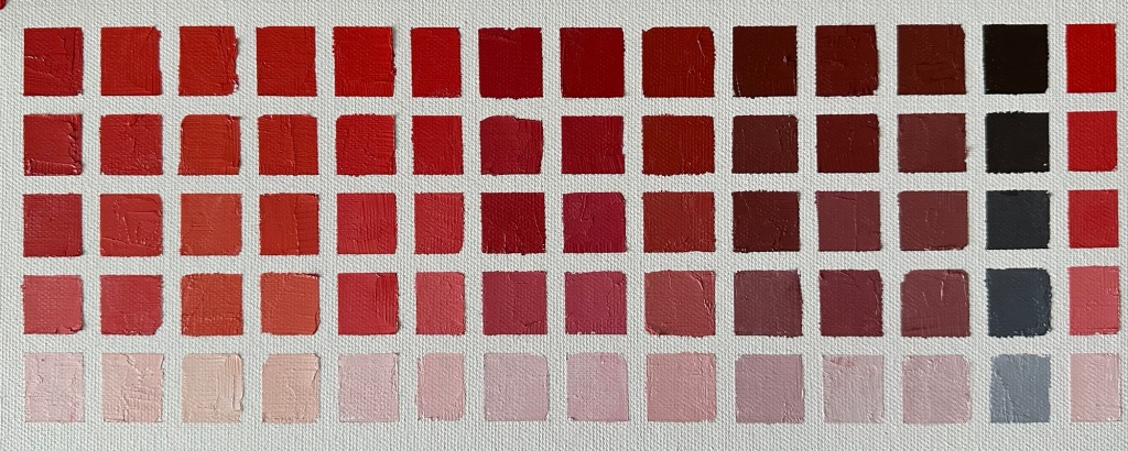
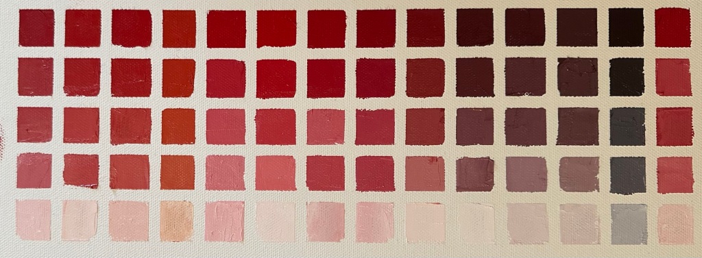
I have deviated from the traditional or recommended approach though. Richard Schmid wrote about using predominant colors. While I have possessed and experiential knowledge of the different intensities of some of the tube colors I hadn’t really explored such. Thus, rather than mixing the way the late great Schmid suggests, I’ve adhered to a predominant color mix relative to the secondary color in a ratio of close to 60-40. This really enables one to understand the tinting character of a particular color. I have also taken the time to use an approximate 30-70 mix with some of the strong colors to pull out some of the lovely hues not seen employing the 60-40 mix.
For example Cadmium Reds are so strong they overwhelm all colors except Caribbean blue. So, to explore oranges, for example, I did some additional mixing studies with these intense pigments and my yellow colors to discover some of the beautiful hidden orange colors. In truth, one can envision and find an infinite number of colors mixing, for example, cadmium red light and cadmium lemon yellow in different proportions and in up to 10 or more value studies for each by adding white. But, what would be the point to demonstrate the range? I think it more important to know there are possibilities. This is knowledge already gained by painting. A dab of Cd red light with a bigger daub of yellow ocher mixing in white and maybe a touch of yellow until the right flesh tone has been achieved. You won’t find that flesh tone on the mixes in focusing on but you’ll find something very close that may work with the overall harmony. So, while these mixes are useful, they’re artificial as the key to a successful painting is choosing color saturations, tones, and temperatures then applying the paints properly to achieve an actual painting.
Also, I’ve adhered to a 75-25, 50-50, 25-75, and 5-95 scheme when mixing with white. I felt this was best to fully understand these tube colors. Some paints have a much darker clue than others. I suppose trial and error would be informative to try to paint each of the value mixes with a proportion to arrive at similar values across the board. This is something I may do in the future. Imagine the joy of desaturating a photograph and seeing all five values the same. I think there is learning to be gained. On the other hand, seeing darker tonal paint in the 5-95 mixes from one tube color to another is quite informative and demonstrates the actual comparative tones I expected to see at these degrees of mix.
I look at the Cobalt violet palette and think that it would be superb to use cobalt violet in ever mix to harmonize a painting. I know that would be wrong. Instead, I can study the effects of adding cobalt violet to other colors with white to achieve a few lovey shades that will certainly be of utility. Same is true of all other colors. One has to be careful as the great colors by themselves may not fit in the scheme of a painting desired depending on the light on the subject. What appears to be superb flesh tones on one palette may not work with the flesh tones required based on direct observations of the subject. Still, it’s nice to have a record of some usable and easily achievable flesh colors, grass and tree foliage tones and colors, metallic colors, sky colors, etc. I do believe these revelations are merely a starting point and that almost all of these colors (70 per palette) would be altered to fit within the overall scheme of a painting.
I feel the old adage of paint what you see in “nature” be it a landscape, model, or still life is the best there is to guide artists. These mixing studies will indeed provide a foundation for understanding tube colors and mixes so that a successful painting can be achieved. I’m glad Mosby required Schmid to do them and that I felt compelled to do the same.