My name is Lewis Blevins. I am a physician at the University of California, San Francisco. I’m the director of the California Center for Pituitary Disorders. I am what is called an neuroendocrinologist. I take care of patients with pituitary disorders. My home department, so to speak, is the department of neurological surgery at UCSF. I teach neurosurgery residents on a regular basis. They are involved in helping take care of my patients when they are hospitalized and also after hours and on weekends. For over a decade now I have painted portraits of the graduating chief neurosurgical residents as a gift from both myself and the department to celebrate their years of dedication and hard work and their coming of age as neurosurgeons.
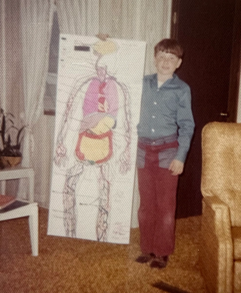
I started painting, seriously, about 25 years ago. As a child, I had explored a little with paint by number sets and watercolors. I’ve always been drawing and spent weekends during my youth in the library drawing anatomical pictures from books including Cunningham‘s Textbook of Anatomy, Grant’s Atlas of Anatomy, and Gray’s Anatomy. I don’t want to date myself but the truth is all of these books were reference books and couldn’t be checked out from the library and taken home for study. Further, photocopy machines were unable to produce vivid images, copies were expensive, and I enjoyed drawing because it helped me study anatomy. Basically, if I wanted to study those images at home, I had to draw them in the library and then cart them out the front door and into the car waiting for me in the parking lot for the trek home. When I was in college, I worked in the morgue as an autopsy assistant to a group of pathologists. I actually conducted about 400 autopsies and of personally removed about over 200 brains and pituitary glands. I had forgotten, until recently, that I had once made quick sketches of some of the anatomical relationships of the hepatobiliary and portal venous systems from direct visual inspection. At any rate, I first started combining medicine and art at an early age and, when I started painting as an adult, I was able to draw upon my childhood experiences with color and draftsmanship.
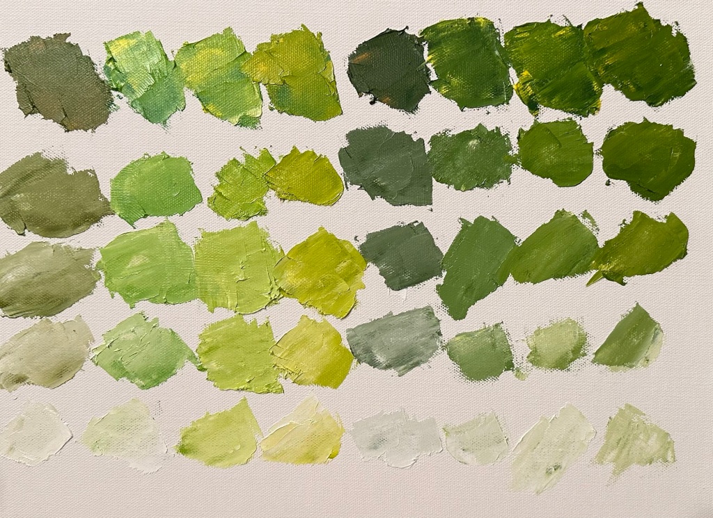
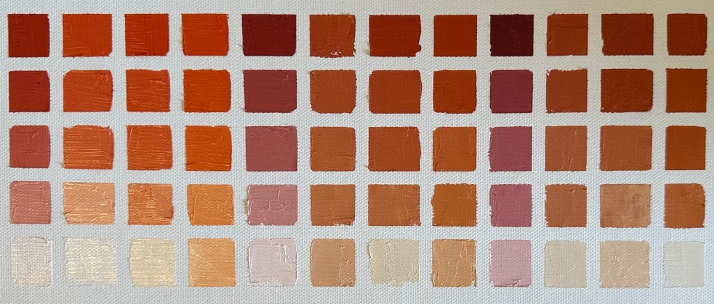
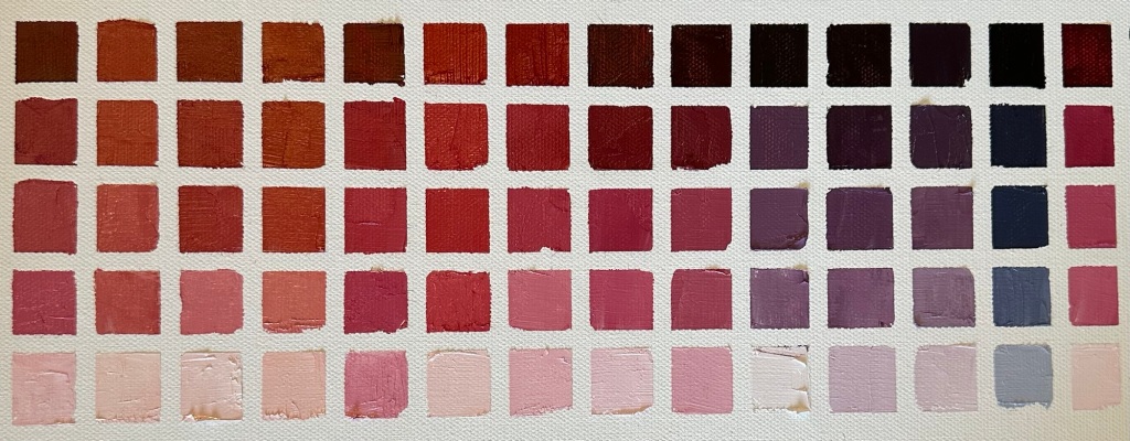
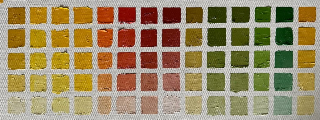
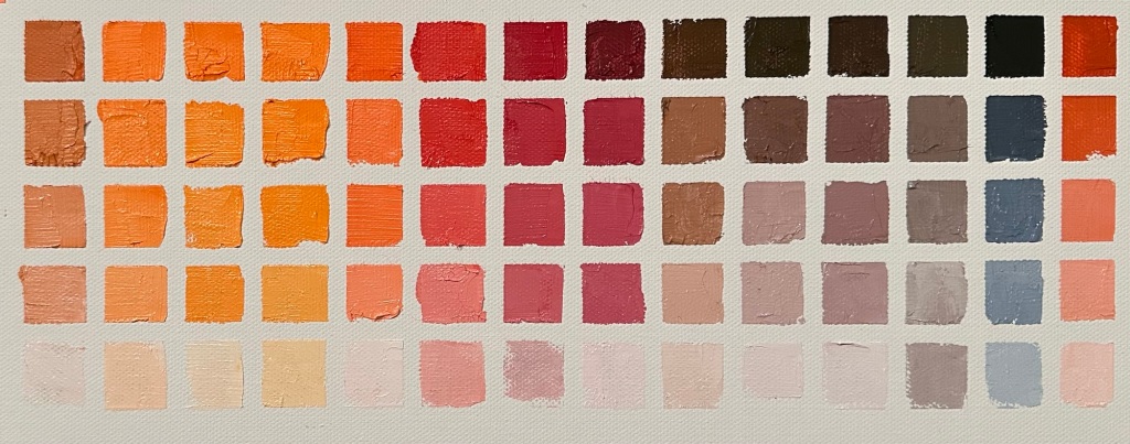
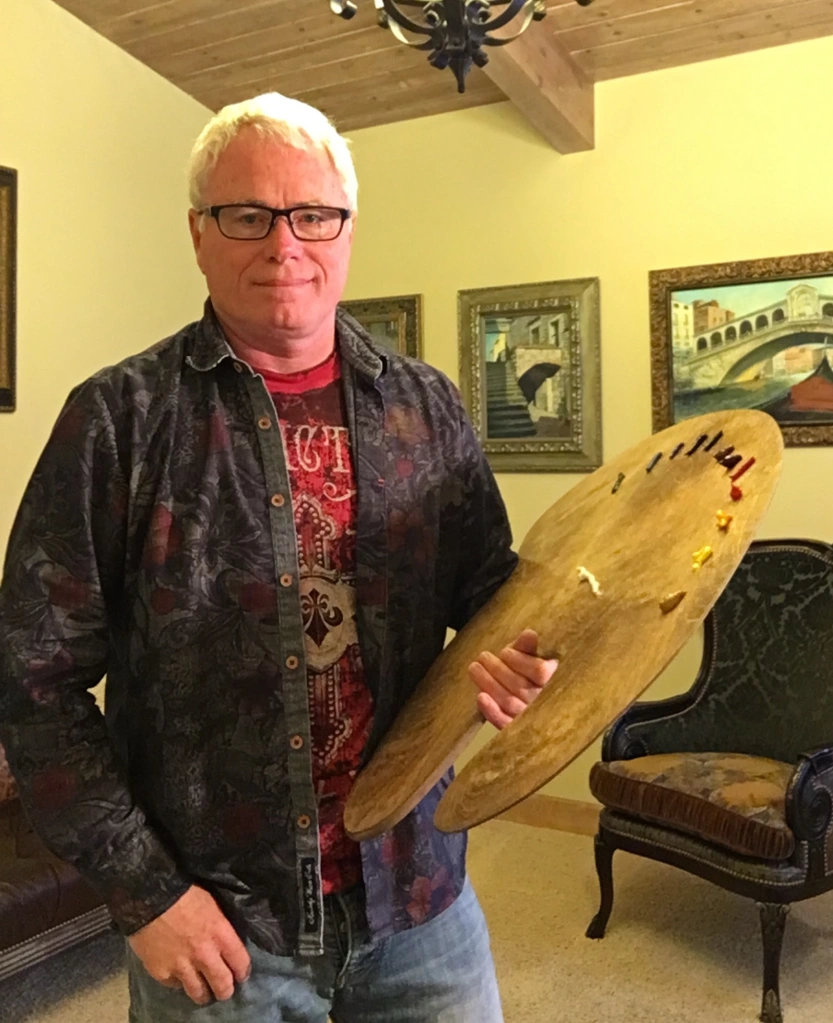
I’ve not had any formal training with exception of two separate weeklong portrait classes under the tutelage of Michael Shane Neal, a renowned portrait artist, and friend. I have, however, studied legions of art books and spent countless hours in art museums around the world carefully studying art of various types and -isms. More importantly, I have worn out hundreds of brushes having painted innumerable miles of paint on a multitude of canvases both outdoors en plein aire and in the studio. There is no substitute to painting in so far as learning is concerned. It is, however, useful to have guidance. The same can be said of learning practically anything that poses a challenge. I will soon take lessons with the esteemed and world-renowned Camille Przewodek who we are fortunate to have as a local California artist. My hope is that she will open my eyes to the world of subtle colors and help me to express the effects of light on subjects in a different way.
https://www.michaelshaneneal.com
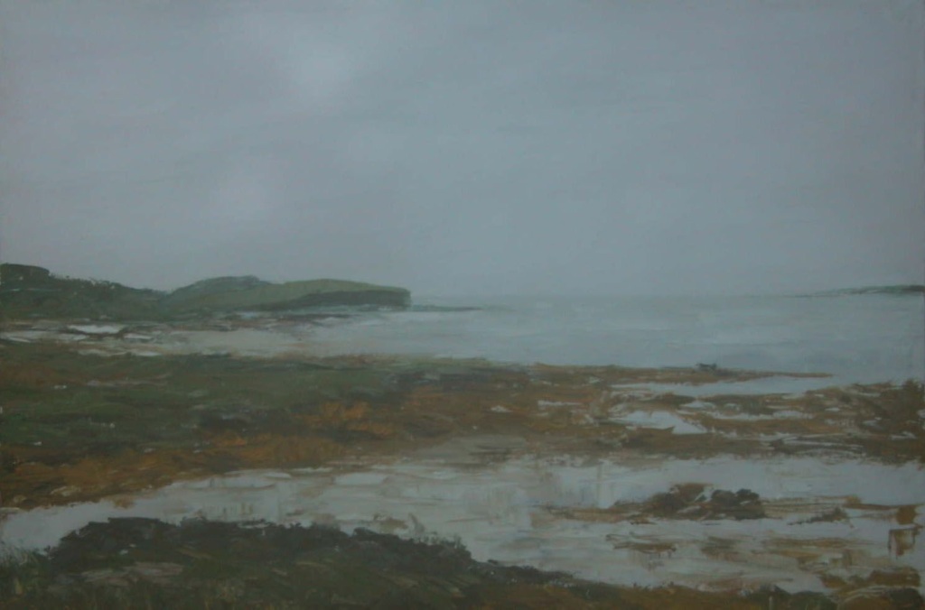
I’ll never forget the day that I was prompted to start painting as an adult. I had just returned from a trip to Ireland. While there, I encountered a painting by a particular artist that I had known of as a friend had collected her works for years. The painting was of tidal waters and was for sale on a wall in a gallery in the town of Roundstone on the West coast of Ireland. I couldn’t get it off my mind and had the itch to own the painting. So, when I returned to the United States, I called my friend and arranged for him to purchase the painting on my behalf and send it to me. It arrived several weeks later. I took it out of the box and was a little disappointed. It didn’t have that same ethereal mystical presence that it had having been properly lit in a gallery that was warmed by a peat fire in a nearby fireplace in a coastal town on a cold rainy evening in Ireland. Of course, it was nice but not what I remembered or expected. Without premeditation, the words just came out of my mouth “I think I could do this.” Prompted by my family, just two weeks later I was in a local art store in Nashville and purchased supplies and started on my journey. I haven’t stopped. There is still so much more to learn and accomplish.
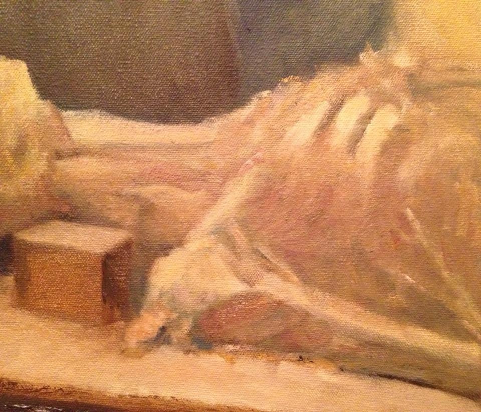
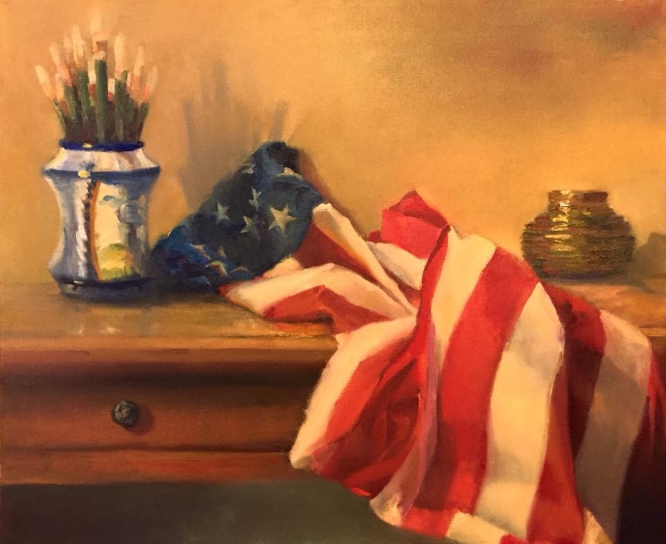
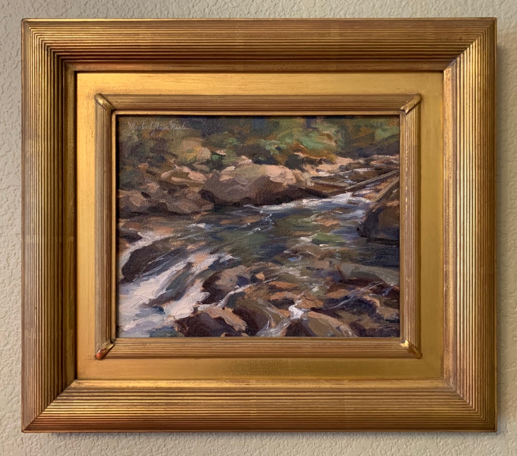
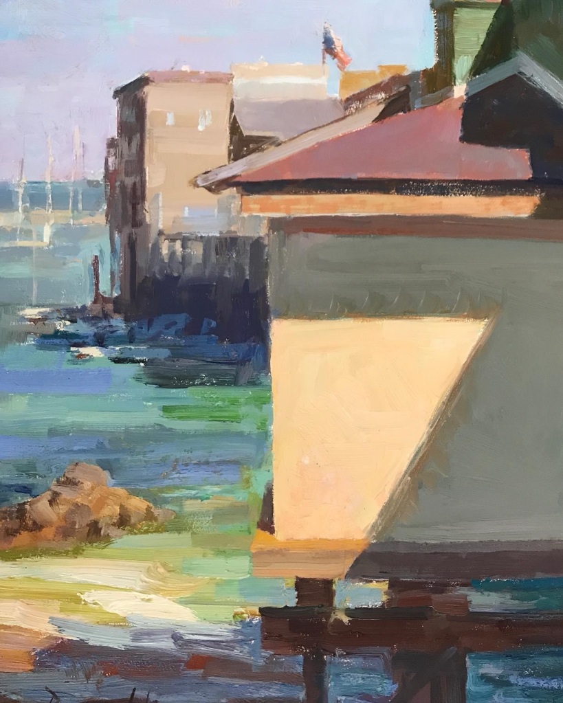
Most of my early paintings were of landscapes. I was interested in capturing majestic or even mundane scenes in a way to show people how I saw the world. I quickly understood the difficulties in representation but got the hang of it through years of trial and error. Of course, I painted a few still life scenes but I stayed away from portraits because I recognized those as perhaps the most difficult of all paintings to accomplish given that there is not a lot of latitude when rendering a subject. Landscapes are different. You can change the perspective, push mountains farther back in the scene, bring them forward, make a tree larger or smaller or eliminate it all together. Perhaps the mountain has an unusual ridge or rise that is not important or visually appealing. You can leave it out. This ability, or opportunity if you will, is useful to both the beginning and experienced painter. It allows one to simplify and save some rendering challenges for later after development of technique, style, and ability to see and actually represent what is seen. It also allows one to improve on a composition or to focus attention on an important element of the scene.
I have noted tremendous development in my approach to landscape and architectural painting over the years by comparing old paintings to recent ones. There certainly has been an evolution in my style and ability to render scenes. In some ways, I like the earlier paintings I’ve accomplished where my brushstrokes were more loose, but on the other hand, they needed to tighten up a lot. I am now in the process of finding that middle ground. I believe that I have also made a lot of progress in seeing in representing color, painting, light, and in composition.


After several years of painting I felt like I needed some instruction. There were mysteries as evidenced by the fact that I had encountered problems I could not solve. I didn’t know where to turn. Of course, I looked in books, art magazines, etc. I made my way through some of these difficulties. I also became familiar with artists I would encounter in magazines and studied their published works. One particular weekend, my family was out of town. I went to a restaurant to have a meal. That night, I became quite ill with what I thought was food poisoning and now recognize as a severe gastrointestinal pistachio allergy (it took years to figure that one out!). That morning, having not slept, but feeling a little better so I decided to walk to a local store and grab a Sunday morning newspaper. I returned home then sat on the sofa and read through the paper front to back. In the “living” section, there was an article about an artist that I had known about through some of the art magazines I had perused. His name was Michael Shane Neal. And, he lived in Nashville! Further, his email was at the bottom of the article. I was probably one of several hundred who contacted him. He wrote me back and told me that he was doing a portrait demonstration soon and that I should join him. I did. I was enthralled. We became friends and remain so today. I was able to visit his studio regularly and I have taken two weeks of portraiture classes with him. I often seek his counsel, study his paintings that I have in my personal art collection, and read and reread his book on portraiture. My encounters with Shane are always a source of motivation. He is the eminent portrait painter in America today. One of the best in the world. He is the president of the Portrait Society, and his accolades are too numerous account. He has painted presidents, senators, other luminaries in Washington DC, actors and actresses, and all sorts of important people around the world. Who would’ve ever thought that a little pistachio would have changed my life forever?!

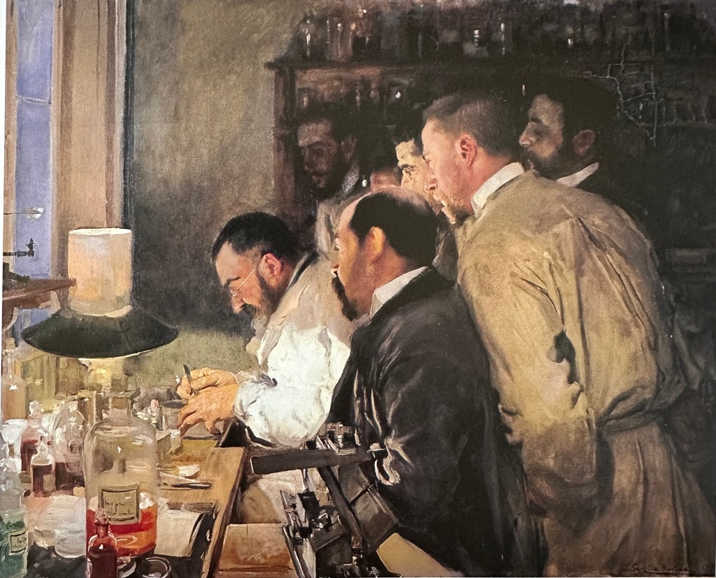
Camille Przewodek, the local artist that I mentioned, is a colorist who paints oils on canvas. She is also an excellent portrait painter but is probably more well-known for her instruction and her tremendous landscapes. She has advanced the colorist movement that started with Henry Hensche on the heels of the impressionists in Europe and one or two other painters. She has superseded her master in rendering landscapes and figurative works allowing us to see light in incredible ways. Camille‘s reputation preceded her. I was aware of her work in different art magazines, and in the art community. I had met a number of people who studied with her over the years. Finally, I saw one day that she was having an open studio at her home in Petaluma so I went. We met and have become friends. I own a number of her paintings and study them regularly. Honestly, when I look at the painting below of Alex Lu, I can see her influence on my work. Probably there is some of that as well in the painting of Jacob Young. I will begin studying with her sometime during the first half of this year.
There are some key differences between landscape painting and portraiture. It’s still painting and many of the same principles apply. In order to successfully paint an individual, however, you have to “get it right,” so to speak. There is very little latitude in so far as drawing is concerned. The subject of a portrait has to be recognizable. The artist wants all of the features to be in the right place, the proper size, the correct relation to one another, three dimensional, etc. The late Everett Raymond Kinstler, a renowned portrait artist who has works in collections around the world, including the national portrait gallery at the Smithsonian Museum in Washington, DC, once said something to the effect, and he may have been relating a comment by another artist, that a portrait is the painting of someone with just a little something wrong with one of the features. The point that I have taken from that notion is that it is almost impossible to exactly replicate the appearance of someone with oils on canvas. The goal is to capture their essence, including personality, gestures, behavior, general appearance, presence, and more so that they are recognizable to the viewers. I’ve learned a lot about portrait painting by simply doing it, from my studies with Shane Neal, and also from my studies of some of the great portraits by Everett Raymond Kinstler, Dawn Whitelaw, John Singer Sargent, Joaquin Sorolla, and others.
https://www.everettraymondkinstler.com/wordpress/
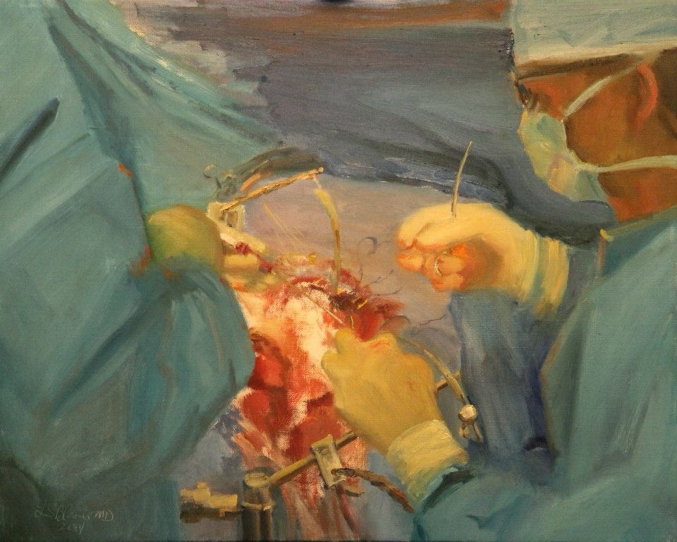
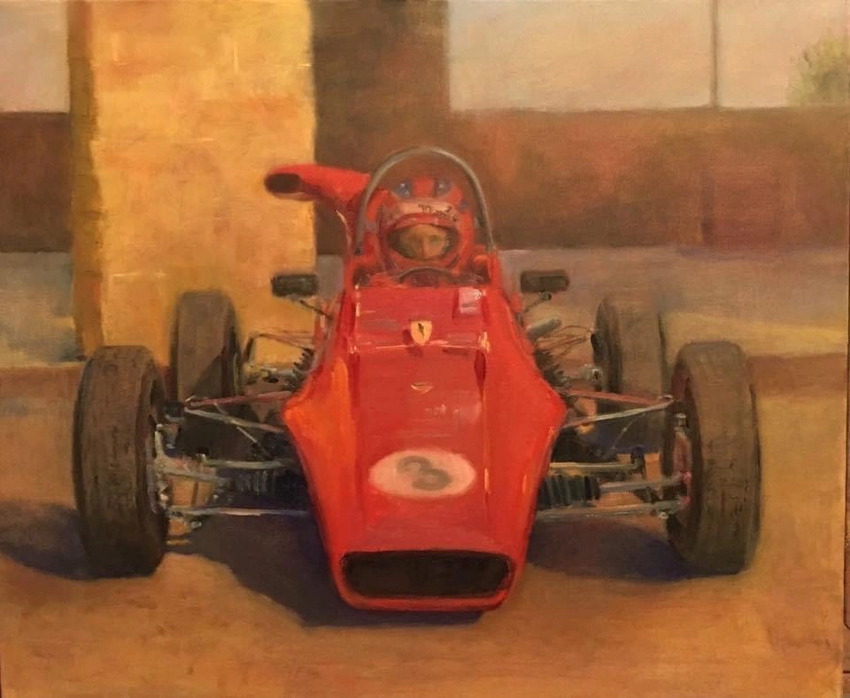
The portraits at UCSF started after a trip to the operating room to take photographs of a colleague, Dr. Michael McDermott. I had asked to be able to accompany him to the operating room so that I could take photographs and consider a painting. He was the subject of the first painting I created from several photographs representing an operation underway. He owns that painting and also a portrait I completed of him in his formula Ford race car.
I honestly can’t remember what happened next. I found myself returning to the operating room on a regular basis to take photographs in order to attempt paintings of our chief residents. Somehow, probably as suggested by Mike, these paintings became gifts at graduation to show gratitude to the chief residents for taking care of our patients.
One of the many benefits of having accomplished these portraits is that I have grown even more as an artist over the past decade. I owe a debt of gratitude to these residents and the department for the opportunities to accomplish these paintings. I always hope that the next painting might be even a little better than the preceding one. I do often look at photographs of the early ones and find them to be somewhat representational but crude and reflective of my relative inexperience at the time the paintings were created. This year‘s paintings are the very best of my works. For now, anyways. I have learned a great deal from each one this year and will incorporate these lessons into the next year’s portraits. Perhaps I will see those as the best have been able to accomplish when they are finished.
Why not just take photographs? And frame them? I will say that I have some really good photographs of our trainees. I believe my photography would still reflect my artistic and creative abilities but not in the same way as do my actual paintings. Also, the photographs are digital. That hard drive they’re sitting on might one day crash and the pictures will then be lost forever. If they are printed, they almost certainly will fade within a lifetime. Further, the camera has restrictions in regards to how it sees and captures images relative to how the eye sees and the artist renders. The paintings, if taken care of, could last 500 years or more as evidenced by the art on museums around the world. So, I believe these works are more permanent than any set of photographs would ever be.
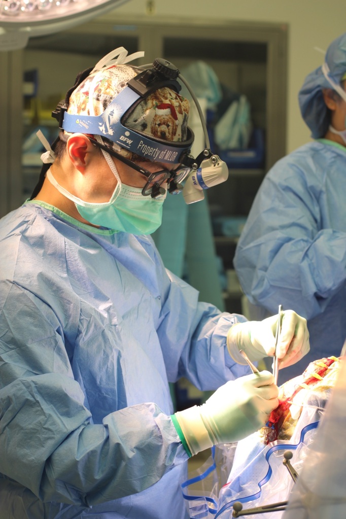
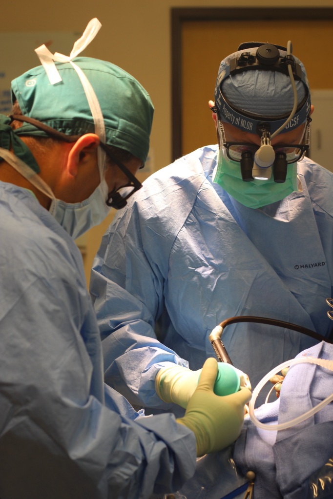
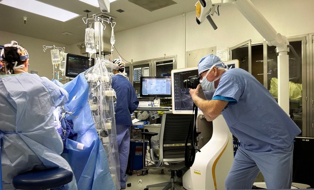
It would be next to impossible to try to paint with paints and brushes on canvas with an easel in the operating room. I suspect that, somewhere in the history of time, someone has attempted or accomplished that feat. I’m just not up for it. It is perhaps a little easier to think about taking a sketchbook and I have indeed done that in the past. I choose, however, to paint from photographs and videos that I take of our residents while they’re operating. I often combine the memories I have of being present (it was often stated in medical school that I had a videographic memory and I would say that’s about right), of studying their gestures and behaviors, with two or three photographs and a video clip or two in order to design a formal painting. I probably take 100 photographs or more of each resident in preparation for the paintings. I vary the exposure so that I can capture different lighting effects and to get the mood that seems to best fit each resident and even the case they are doing. I rove around the operating room and try to get as many different angles or perspectives that I can of my subjects. Of course, I stay out of the way, know what not to touch, and try to do my work without distracting any of of the surgical team members. The process of collecting information for these paintings takes about 2 to 4 hours per resident.
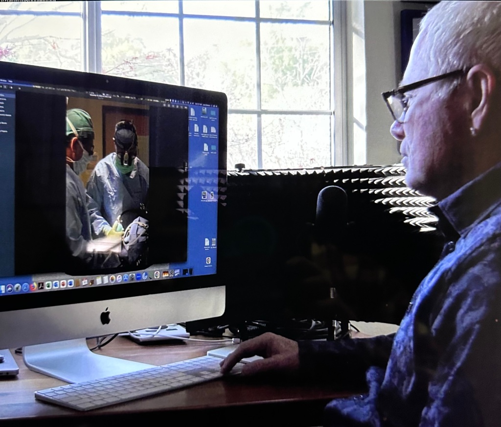
Once I have collected and reviewed videos and photographs I decide how best to represent each of the trainees. Truthfully, I am probably already committed by the time I leave the operating room as I have a pretty good idea of how I want to represent each physician. Occasionally, I’ll do a small sketch to evaluate an idea for a composition. I decide what’s important, what needs to be included, and also must be excluded. There are so many people and so much “stuff“ in the operating room. While it is supremely organized, it looks very disorganized, too. If I tried to represent all of the things one sees in the operating room the clutter would overwhelm the actual portrait. So, I leave a lot of it out. Sometimes I will suggest it or even simplify something that is rather complex. Occasionally I will include something to suggest another human being to remind the residents that they aren’t able to accomplish their work by themselves. The decisions about what to keep and to discard from the scene have become easier over time. In essence, there is some liberty in portraiture, as there is in landscape painting, but not a lot when it comes to painting the actual person.

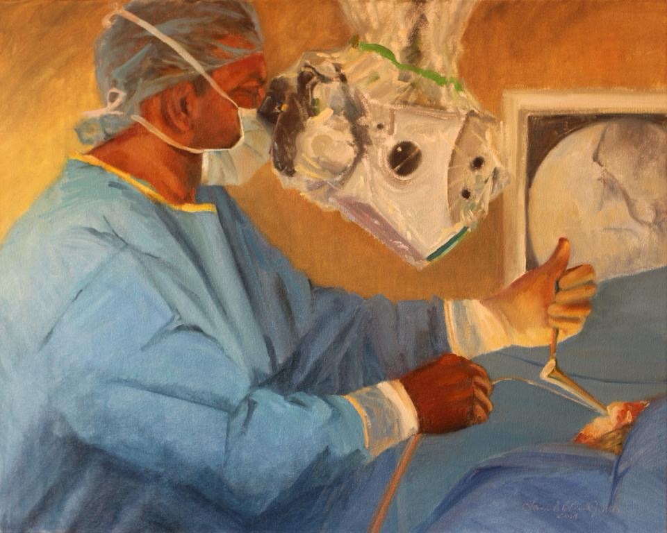
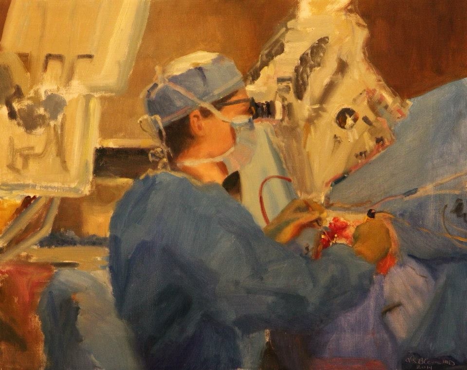
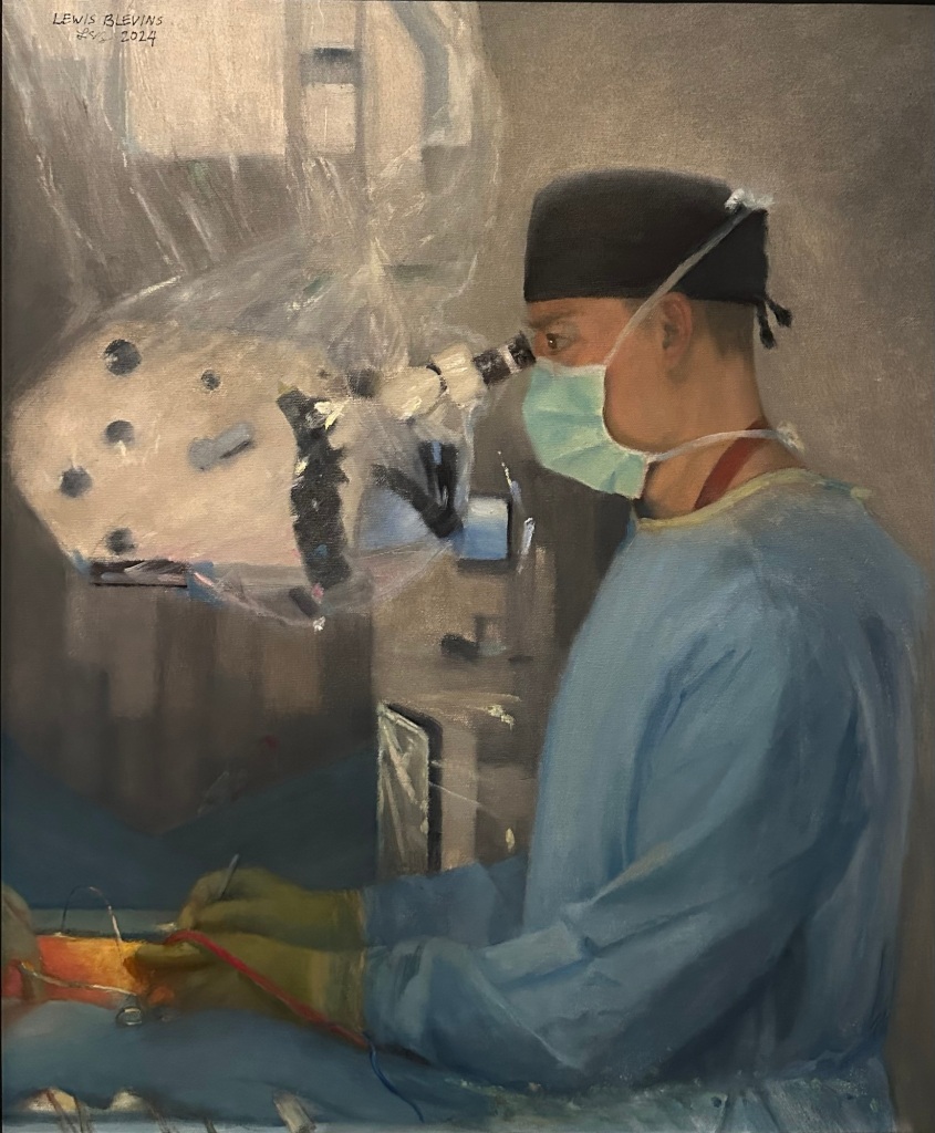
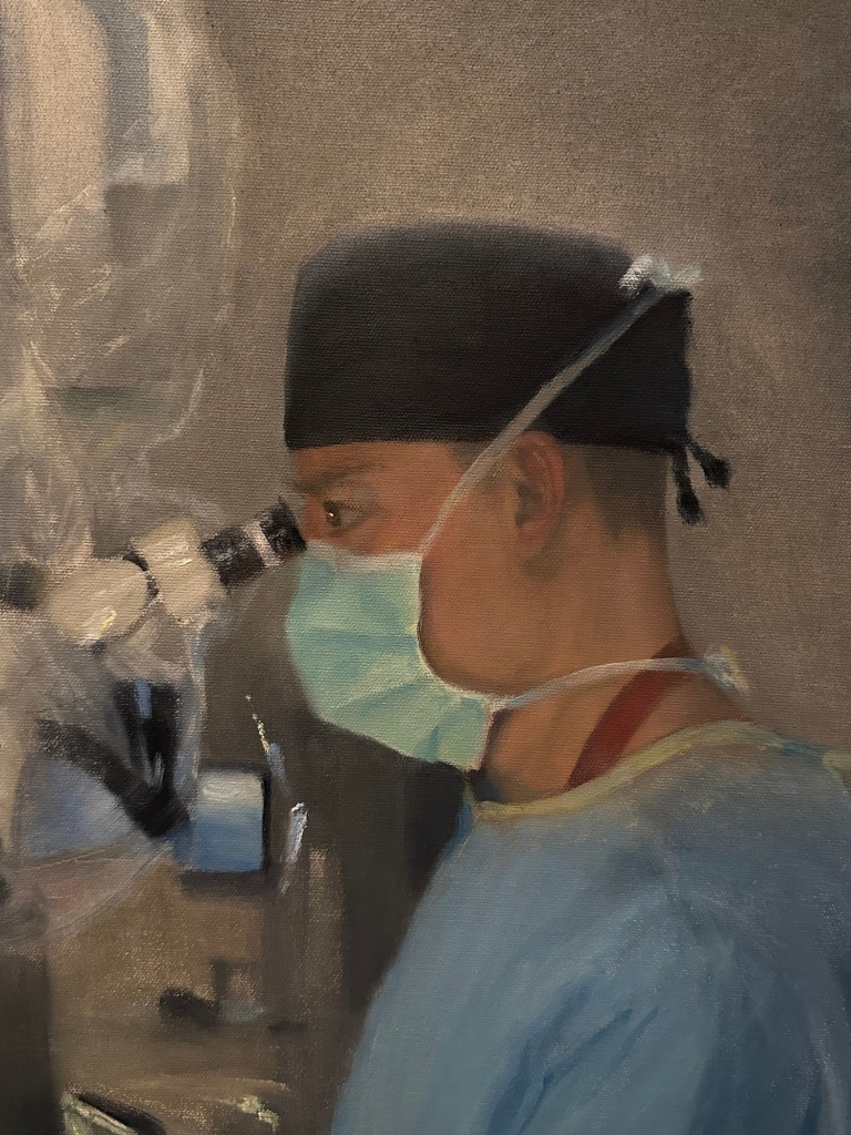
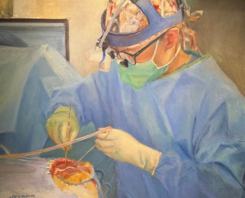
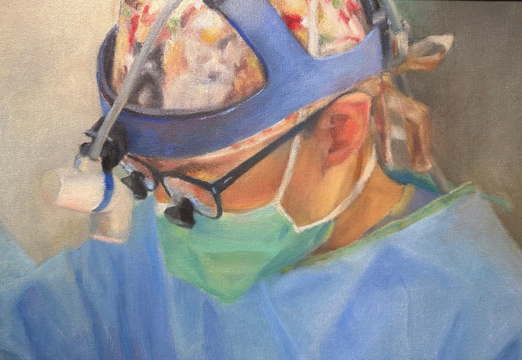
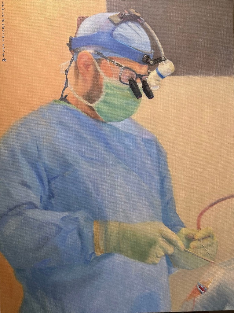
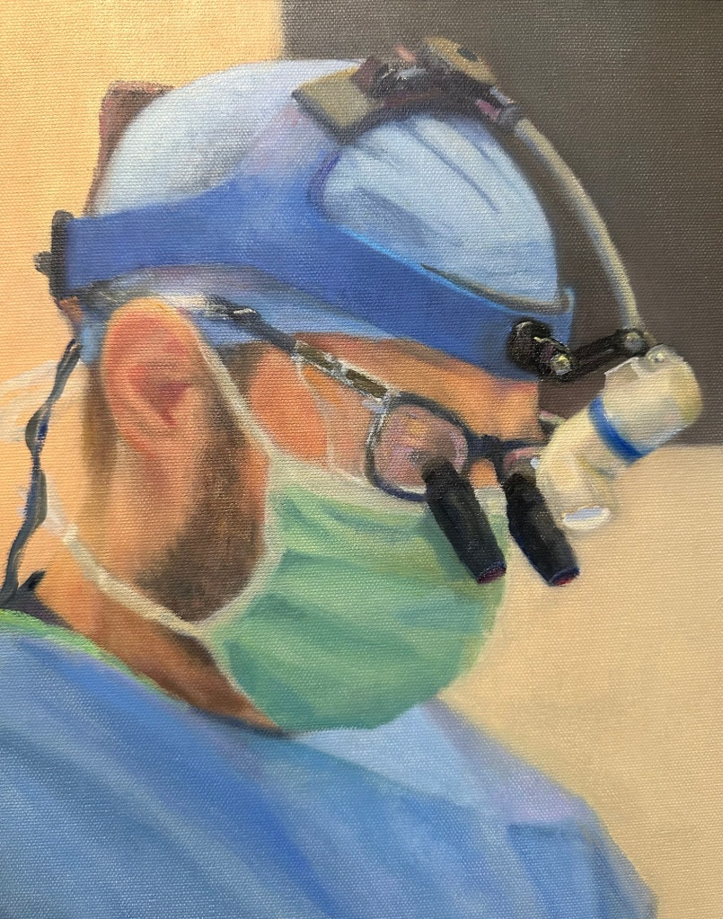
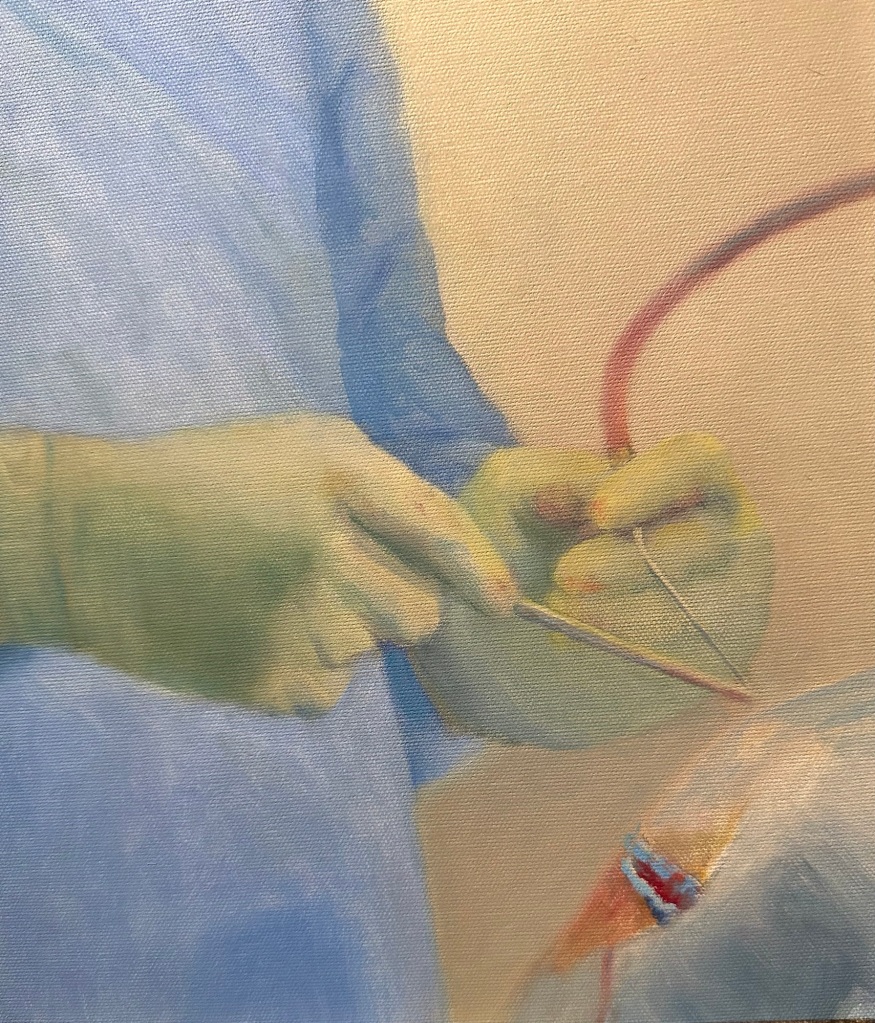
In my opinion, the three main focal points or key areas of interest in these surgical portraits are the head, the gesture, and the hands at the operative site. I’ve learned that it’s critical to get the gesture and the exposed areas of the head right. For example, I spend more time, making sure that I paint the ears correctly than I normally would in a portrait. This is because the masked men and women are often difficult to recognize by those who don’t see them regularly in the operative setting. So, I try to catch the general shape of their head, their ear, and even their operative glasses, as well as their gestures to represent their likeness. I find it very affirming when one of our attending surgeons sees the portraits for the first time and knows precisely who I’ve painted. I know “I got it right” when someone says “that’s exactly how he stands” or “ you even got his big hands.“
I understand that it’s somewhat controversial to paint the operative sites. Some people simply don’t like looking at blood, or even even the suggestion of such. I usually try to deemphasize the operative sites in my paintings. I include enough so that the viewer knows that it’s surgery. I probably include too much and it’s one of the things that I consciously try to be aware of each passing year. In some cases I’ve tried to paint head and shoulder scenes and to leave out the operative site but these paintings are lacking in drama and authenticity. Part of the mystique of surgery, and revere for surgeons performing the operation, is that an individual is opening another persons body to try to help that individual. It’s one of the most powerful and awe inspiring things imaginable and I feel it must be rendered.
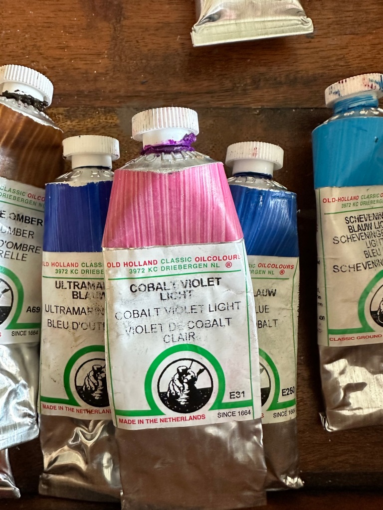
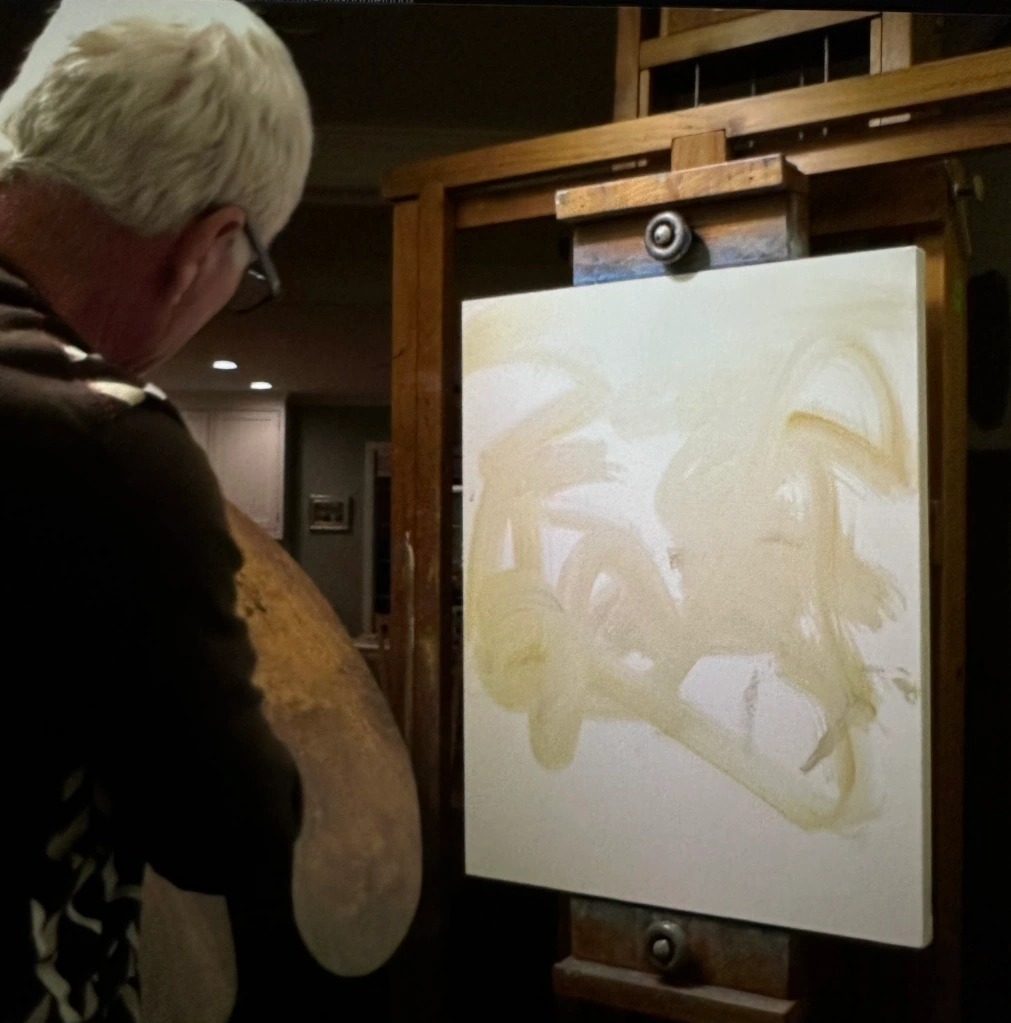
I usually start each portrait with a sketch on canvas. Depending on my mood and the difficulty of the painting, I might sketch very loosely or else have a fairly tight sketch to start with. The lines disappear because I paint over them instead of to them or within them. Sometimes I sketch with charcoal or a pencil, and at other times with paint. In this stage, I’m usually just working out composition issues and making sure that the placement of the different components of the painting are going to work with the canvas size and aspect that I have selected for the portrait I’m starting. I usually begin with an underpainting, just blocking in colors and shapes, expressing some of the darker areas, the mid tones, and the light areas. After that, it’s a process of continually refining colors, shapes, tones, painting, atmosphere, etc. I work and rework (we don’t like to say we are correcting but that’s exactly what we are doing) until I’m satisfied with how the key elements of the painting appear when viewed from across the room. When it’s done…it’s not really done. I usually let them sit around for a week or two and then take another look and find something that I want to adjust. I would say the average portrait is addressed and “corrected” two to three times after I had originally thought it was finished. Ultimately, they are done, or nearly so, and I will let them rest then varnish and frame them and prepare them for presentation.
I am often asked how long it takes to accomplish these portraits. It varies. The time is largely dependent on the degree of difficulty of the scene and whether there are any perspective issues that I need to resolve. Unusual perspectives, such as looking down on or up to a resident take more time. If there is significant foreshortening, such as an arm or hand coming toward the viewer and out of the painting, that takes some clever work to make that look realistic in two dimensions and it takes time. My best answer is that after 25 years of painting, and 10 years of painting graduating chief residents, I can accomplish most of these paintings in about an average of 25 hours each of deliberate focused work. One of the recent paintings took about 30 hours. it seems like a lot of time. I will say, however, that my teacher, Michael Shane Neal, once told me that he had just spent 80 hours of work on a commission of a luminary in our nations capitol. That was years ago and after decades of experience as a portraitist.
I have recognized, and especially over the past several years, that my art is a way of bringing others into the operating room to see the men and women in our program at a key transition in their lives when they have become neurosurgeons. Family members, coworkers, and others are invited to see these young physicians as I see them and rendered them. I know the portraits mean a lot to the individual residents and recognize they mean even more to their families. I get the sense that, for some, these paintings will be family heirlooms. It’s an honor to have the opportunity to create something that is viewed in that particular way.
I often use my works to stress the importance of the art of medicine to our trainees. I draw parallels to my process of painting and work as an artist to their work as surgeons. I focus on decision-making, the process of learning new approaches and in advancing ones craft, of studying the work of others, understanding history, and more. I encourage them to pursue a lifetime of recognition and practice of the art of medicine coupled with the science of medicine (as I have to do in painting) and hope that seeing these portraits will remind them of such throughout their careers.
I will admit that I get more out of this approach than the opportunity to paint, grow as an artist, and to teach our trainees about the art of medicine. I sincerely enjoy watching neurosurgical cases. Most importantly, I get to see my attending colleagues doing what they love doing the most as physicians. Furthermore, I have the opportunity to see our residents from a different perspective. For six years or more I have had the opportunity to work with them in the outpatient setting or in the hospital and in conference settings. I try to teach them to be internists who do neurosurgery. I become accustomed to and cognizant of their work products. I try to advanced their knowledge and understanding of pituitary disease and relevant endocrinology and to shed light on their evaluation and management of fluid and electrolyte disorders. With the process of creating the portraits, I finally get to see them as young newly minted neurosurgeons. I often leave the operating room, with my camera in hand, and my head full of ideas for their portraits, having been delightfully impressed with the chief residents. To see their gracefulness, economy of motion, intraoperative judgment and decision making abilities, their technical skills……. they make me very proud of what they have accomplished with the guidance of our faculty coupled with their drives, determinations, ambitions and motivations, as well as their work ethics. I will remind them, however, that the most important contributors to their education are the patients on whom they have been permitted to operate. These souls, many of them with serious and life-threatening illnesses who risk their lives for a chance at living a little longer and offer the most explicit trust to a group of relative strangers, are the real heroes of medical education.
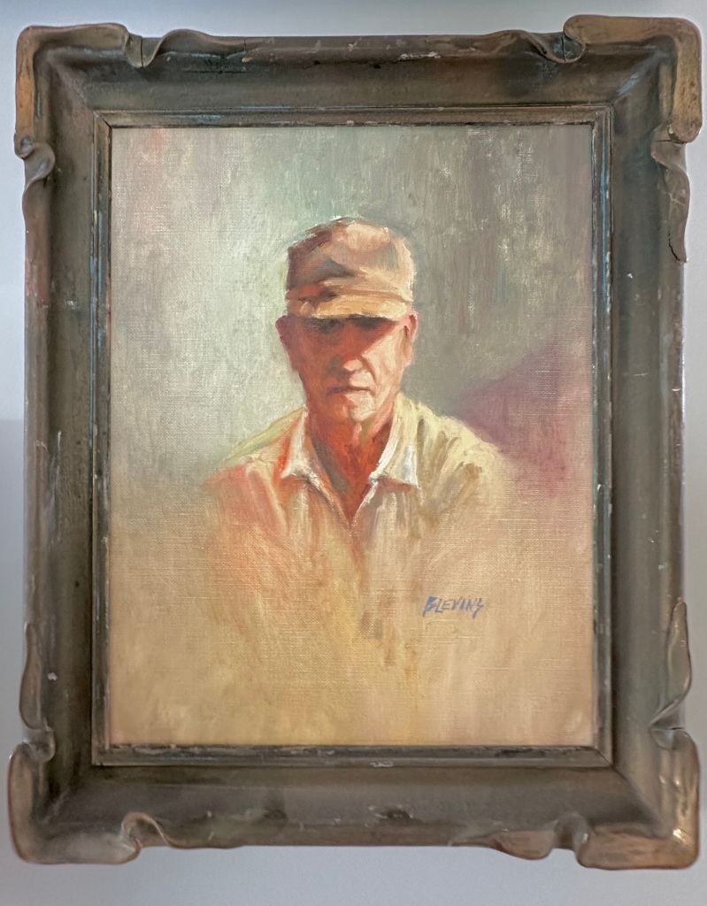
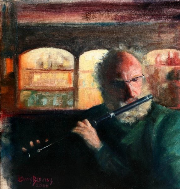
It should be rather obvious that I see portraiture as an important, and perhaps necessary, means of conveying the work that physicians and surgeons accomplish daily in order to care for patients. This is also true of other health professionals, too. One of my favorite portraits rendered by someone else is of laboratory scientists by Sorolla. I suppose the art of the portrait can and has been used to represent any profession. Some of my earliest portraits are of my grandfather, a farmer, and also of my father at his job site as a pipe fitter foreman and supervisor on a construction site. I’ve painted musicians, and, as mentioned, even a race car driver! At any rate, I don’t think that portraiture is given the reverence or importance that it should be at a place like UCSF. When I trained at Johns Hopkins Hospital, there were portraits of famous physicians on almost every wall that I passed by. The same was true of the halls at Vanderbilt University. There are a few portraits at UCSF, but I can’t think of more than a handful that I’ve seen over the years. Given the magnitude of institution and the number of giants in the field that have walked the halls at our institution over the past 100 years you’d think there would be portraits everywhere. Maybe I can change that. Not that I want to paint them, mind you, but to inspire others to want to see this art form used to not only honor great men and women, but also to remind others of those who have blazed the trails to modern medicine.
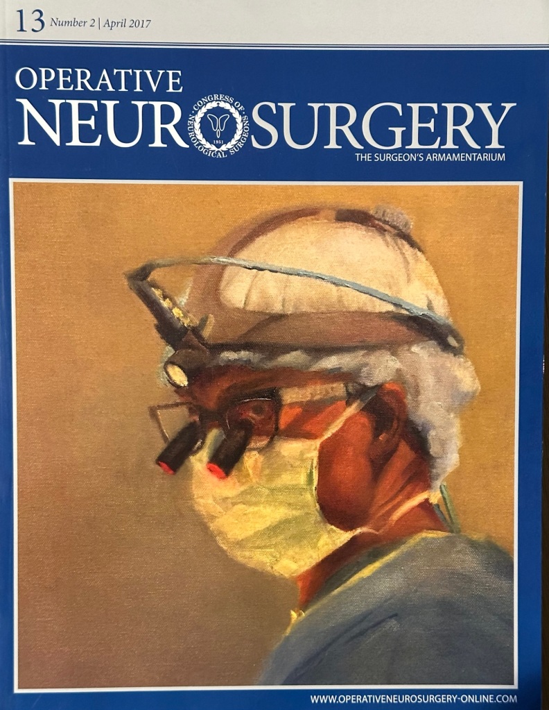
I’ve been fortunate to have had my portraiture included on the cover of four different issues of the journal Operative Neurosurgery. I’m always delighted to have a cover because it features one of our residents with a little background information and it draws attention to our top rated neurosurgical program at UCSF.
Finally, here are the portraits of our UCSF Neurosurgical Residents graduating in June 2024.
Lewis Blevins MD -March 2024.